
Have you ever had a moment like this — AI generates a web page for you in a single minute, all the features are there, yet you stare at the screen for a long while and just feel that something is off?
Say "make it a bit prettier" and the next version it hands back is much the same; say "redo it" and you worry that everything you got right will be torn down too.
Today we pick up from last issue's Hanzi Master and talk about how to take a web page that "works" and refine it, step by step, into one that "looks good" — not by relying on taste, but on knowing how to speak.
First, a counter-intuitive thing
Many people assume that revising a draft requires a grasp of design, that you have to be able to say words like "hue", "contrast", "white space".
In fact, no.
When AI revises a draft, skill with words matters more than taste. Say "I want it to look a bit nicer" and it will only hand back a similar version; say "change the card background to a warm tone that echoes the background but is slightly deeper" and it can act at once.
That is the difference — the more precise the information you give, the more precisely it revises.
Setting the tone relies on nouns; fine-tuning relies on adjectives.
Below I break down the 5 sentences I used when revising, for you to see.
✅ Sentence 1: Give a theme word, not a description
At first I wanted to write a long paragraph of requirements — things like "ancient style", "ink wash", "cultural depth" — and after two lines even I felt it read like official website copy.
Deleted. In the end I squeezed out just one sentence:
My website's theme is Chinese characters; based on that theme, design a more beautiful UI for my whole page.
I gave no requirement at all, neither for colour nor for font.
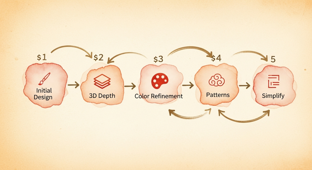
Gemini 3 ran for 287 seconds and came back with a whole style system, which it named itself "Scholar's Studio":
Rice-paper colour #F9F4E8 as the background, a warm off-white
Cinnabar red #B22222 for seals and emphasis
Ink black #1A1A1A for the text
Antique bronze #9C9478 for decorative lines
It even threw in red seals, a grid-paper background, and a scroll-style character-puzzle module.
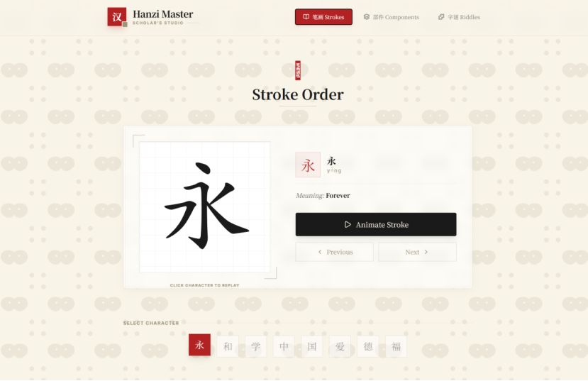
I never mentioned "rice paper", "seals", or "grid paper" once — it filled them all in on its own.
The reason is simple: give a clear theme word, and AI will automatically summon the whole set of cultural symbols behind that word. The more you ramble, the more you box it in.
How to use Sentence 1: toss in the theme word, let it deliver a first version, and only then discuss the details.
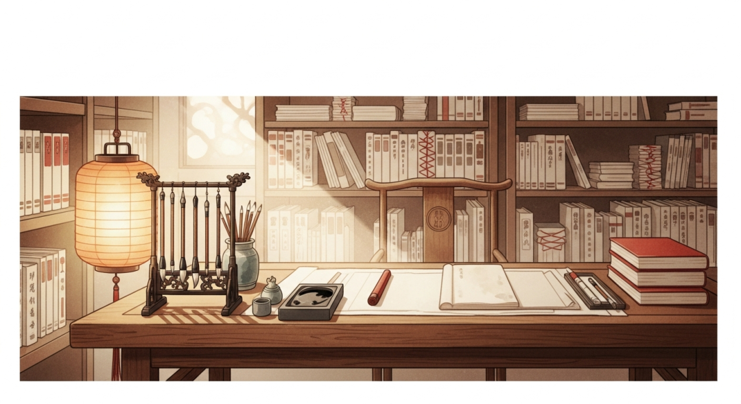
✅ Sentence 2: Talk about feelings, not parameters
The cultural flavour came through, but the background was too busy and kept distracting me while I read. And the whole page was "mushy" together, with no layers between the cards and the background.
I typed one line:
The background is a bit cluttered; I want the overall interface to be more three-dimensional.
One sentence packed in two requests, and honestly I did not expect it to nail them both at once.
But it handled it very cleanly:
Declutter: cut the bat-pattern opacity to 5%, then add an extremely fine grain to mimic rice-paper fibre
Depth: make the cards a paper-stacking effect, with layered shadows + tiny offsets; the buttons get a press-down animation; the header gets a drop shadow
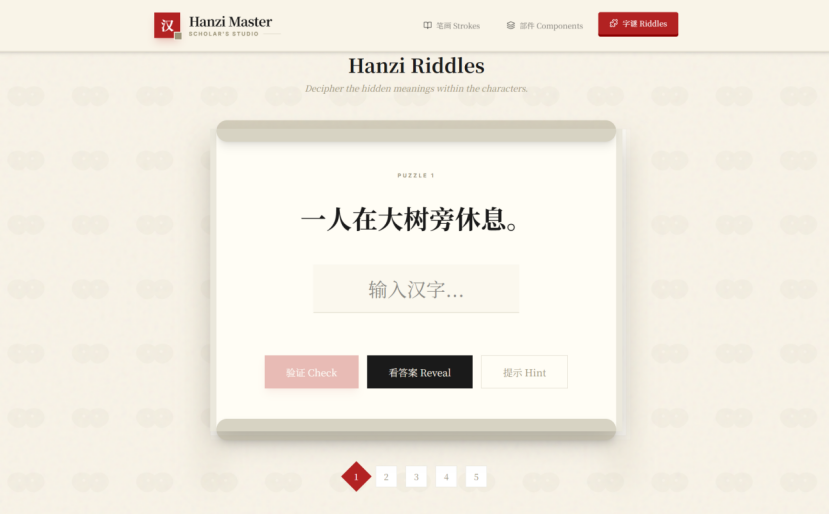
What I typed was two adjectives, "cluttered" and "three-dimensional"; what it gave back were operations I could not have named at all — "paper stacking", "layered shadows", "offset animation".
The point is right here: we only have to describe the feeling; AI is responsible for translating that feeling into code.
Adjectives carry the emotion, nouns carry the precision — and the emotion is yours to supply.
✅ Sentence 3: Lock the location, leave everything else alone
The sense of depth was there, but the cards in the "strokes" and "components" sections still had a pure white background, jarring with the rice-yellow rice paper of the whole page and standing out badly.
This sentence I stated very specifically:
I would like the background colour of the cards in the strokes section and the cards in the components section to change from white to another colour, and traditional Chinese patterns to be added.
Notice the structure of this sentence:
It names which two sections (strokes, components)
It names which property to change (background colour + pattern)
It mentions nothing else at all
This is the pitfall easiest to fall into when revising — say "the card colour does not look good" and AI may change the navbar cards along with it. You have to tell it: which one, change what, leave the rest alone.
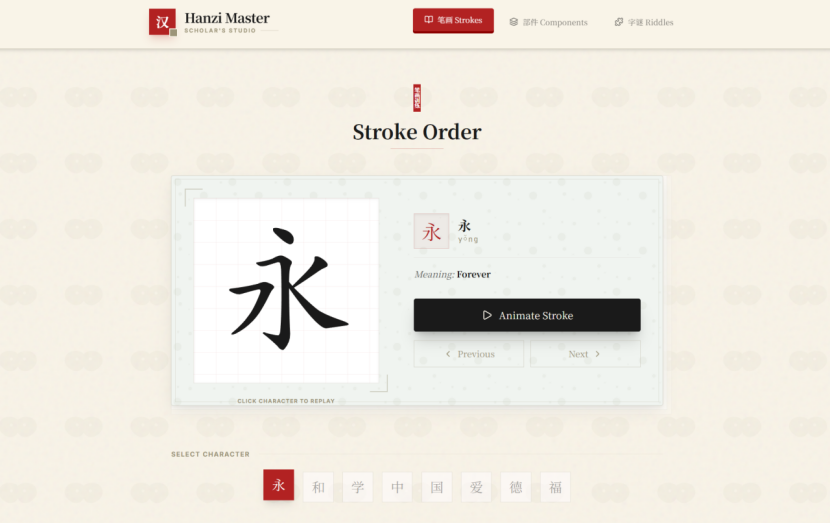
What it served up was celadon green #F0F4F0 plus a traditional cloud pattern. On its own it looked rather nice; put together... slightly problematic.
✅ Sentence 4: Give a standard, not the answer
Celadon green leans cool, the rice-paper background leans warm; side by side the two tear the visuals apart, and it feels uncomfortable.
This cut was my proudest of the whole round of revision. I did not say "change the colour", nor did I look up any colour codes; what I said was:
The colour should echo the background but not be identical — there has to be a distinction.
Two sentences: one asking for resonance (same colour family), one asking for distinction (brightness or saturation should differ a little).
AI switched to antique silk colour #F2EAD3 — the same warm tone family as the rice paper, a touch deeper, and with the card shadows it separates clearly from the background without being jarring.
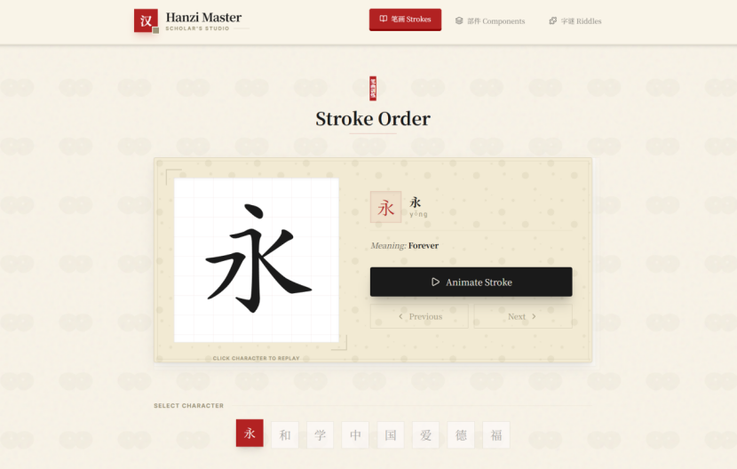
I did not tell it what the colour was; I told it what "right" looks like.
Do not tell AI what the answer is; tell it what "right" looks like.
Please do remember this sentence; its use goes well beyond revising a draft.
✅ Sentence 5: Say where it bugs you, no explanation needed
One last small flaw: the grain noise added earlier for the paper texture — after looking at it a while, it always felt unclean.
I could not be bothered to explain, and typed three words:
Remove the specks.
Then I went to pour a glass of water and came back — it had precisely deleted the noise filter but kept the three-dimensional paper-stacking shadows. It even swapped the cloud pattern on the cards for a water-ripple one along the way.
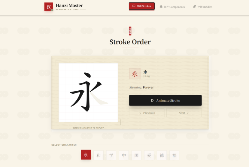
It did not apply a blanket rule — it reasoned about what "specks" actually referred to.
How to use Sentence 5: if there is a local problem, say only that spot; do not tack on a long explanation. AI will judge the scope of impact itself and will not disturb other places.
💡 The 5-sentence checklist — just copy it and use it
Here is a checklist you can copy directly:
Set the tone: "My theme is XX, redesign the overall UI for me" — give the theme word and let it run first
Declutter / depth: "The background is a bit messy; I want it more three-dimensional" — describe the feeling, do not worry about jargon
Change details: "In section XX, change XX from A to B; leave the rest alone" — lock the location + lock the property
Find balance: "The colour should echo XX but be distinct" — give the standard, not the answer
Remove flaws: "Remove XX" — say where it bugs you; three words is enough
Today's summary
The most important sentence today:
Change only one thing at a time; AI hears your words clearly, but it cannot carry your greed.
Going from a web page that "can be looked at" to one that "looks good" does not require understanding design — only the ability to state your feelings clearly.
Open the web page you finished last issue, find the spot that bothers you most, and change the first sentence.
AI produces a draft in a minute; mastering it depends entirely on five rounds of revision.